Tuesday, 30 December 2014
Learning to use Photoshop
I found that spending one lesson learning how to use Photoshop was not enough for me and I needed to learn outside of lesson time as I was very confused and still didn't know how to use the tools on the software properly. Like any normal teenager I went onto YouTube and watched tons of tutorial videos which helped me understand how to use some of the tools better.
Here are the links to some of the videos I watched which I found to be useful. From these videos I got an idea of how to change colours, how to remove backgrounds and other useful facts.
https://www.youtube.com/watch?v=OjRqZiAgoHo
https://www.youtube.com/watch?v=ifhEx4adAa8
https://www.youtube.com/watch?v=C2Srw245R7U
Monday, 29 December 2014
Friday, 26 December 2014
Panning Ancillary
I have spoken about this is my research blogs but this is a short list of my mise-en-scene
- Black and white possibly grey colour scheme
- Thin, Simplistic font
- mid shot of my artist in the front with her name and her album name on top.
- The ideas of having roses scattered around (Maybe)
- The inside panels will have a image of her looking away from the camera whereas on the cover it will have an image of her looking directly a the camera as she is a new artist and needs to be easily recognised.
- The CD will be black with recognition of the Record Label company and the copy right
- The advertisement will have the same theme so the audience can make link backs to the album cover but a different image may be used
- The dates of the concert and the release of the album will be bold and easily visible
Monday, 22 December 2014
Thursday, 18 December 2014
Design activity
This Is the first time I have used Photo shop and I have to admit I was not good at it at all!
The hardest thing was using the 'wand tool' to cut the image and remove the background Also it was difficult picking a font that would match the theme of the album cover. The images given were not the best quality but I managed to work around that and used a gradient tool to add a misty effect to hide the bad quality picture. I have followed the conventions of a album cover my adding the Label record company and the producers, I have also added a bar code. The track list would normally be longer and the name of the artist should be a brighter and bolder font.
Wednesday, 17 December 2014
Location for Ancillary Photos
Location For Ancillary
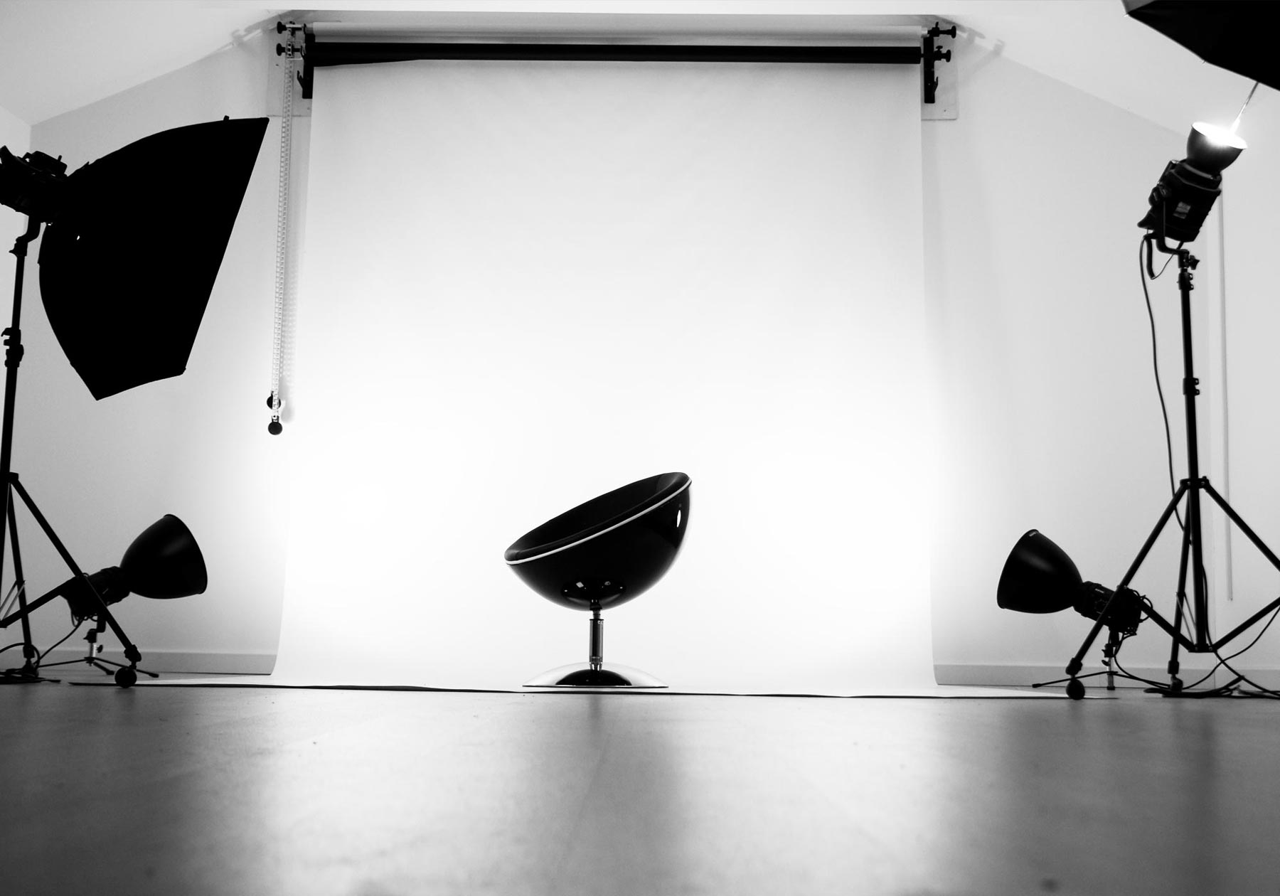
For the Ancillary photos we took the pictures in the photography studio as we had decided we would have a coloured background in one colour for our digipak and advertisement. When it comes to producing our ancillary it will be very easy to erase and add effects to the photo as the background is white. Also having a blank white background helps the artist stand out more. As we used the photography studio we had extra lights which helped us as the pictures were very bright and clear. We were also able to use the photography camera which have better quality than the normal digital camera which was another plus.
For the Ancillary photos we took the pictures in the photography studio as we had decided we would have a coloured background in one colour for our digipak and advertisement. When it comes to producing our ancillary it will be very easy to erase and add effects to the photo as the background is white. Also having a blank white background helps the artist stand out more. As we used the photography studio we had extra lights which helped us as the pictures were very bright and clear. We were also able to use the photography camera which have better quality than the normal digital camera which was another plus.
Ancillary Costume
Ancillary Costume
As we have a theme of black and white throughout the music video which is shown through the costume design and we chose the same colour theme for the ancillary. In the music video the artist is seen mainly wear a lot of black clothing so we decided to have her wear a white turtle neck as the colour would stand out more.
We also thought that having the artist in white clothing would be a good contrast as we decided on having a white colour font for the DigiPak and Advertisement.
Photos Taken to Use For Ancillary
Photos For Ancillary
In todays lesson we presented our ancillary pitch we decided to go into the photography studio to take pictures for the album cover and advert. As this was during the last 20 minutes we had to be quick however we knew what types of shots we wanted so this saved us time.
We knew we wanted close ups and mid shots with the artist looking straight at the camera as one of the functions to sell a new artist to the audience one way is by having looking at the camera so there is a full image of the artist and people will be aware of how the artist looks and can associated their music with the artist.
Short List of Ancillary Design
Short List of Ancillary Design:
- Will be using the font Avenir Next in regular for the title of the album and track list as well as for the advertisement to show a continuation as well as a link between the advertisement and album cover.
-Using the font Abadi MT in extra bold on the artist name which was used at the beginning of the music album to show the link between the album, advertisement and music video.
- The placement of the artist and album title will be placed at the top of the font panel as it will help grab the attention of the audience.
- The track list will be placed down the middle of the second front panel.
- The font colour on the advertisement and album cover will be in white and the background will be grey, to show a visual link between the two.
- The advertisement will be in landscape
- The image used for the front cover will be either a close up or mid shot of the artist facing the camera to help sell the artist to the audience
- The inside will have another image with a message from the artist herself.
Tuesday, 16 December 2014
Monday, 15 December 2014
Sunday, 14 December 2014
Saturday, 13 December 2014
Friday, 12 December 2014
Thursday, 11 December 2014
Wednesday, 10 December 2014
Monday, 8 December 2014
Saturday, 6 December 2014
Skills development
There are many new skills that I have gained and learnt while editing our music video;
- Learned how to use the blade tool
- learned how to 'flop' a video
- learned how to colour correct
- learned how to save a video properly and upload it on the blog
- learnt how to mark and lip sync properly
Friday, 5 December 2014
Notes on evaluations 1
In what ways does your media product use, develop or challenge forms and conventions of real media products?
Final Video
This is our final video of Emeli Sande-Daddy
03. Saheba, Arifa, Shardonnay, Tasmin from 283goswell on Vimeo.
Finished!
Finished
We have finished the music video, today we came in to add the last transitions and we got our teachers to look at the final video to give us feedback on any changes that are needed, from their feedback we decided to take out the super imposing scenes as it was too distracting and as the lighting was very dark we had no chose but to take it out.
We have finished the music video, today we came in to add the last transitions and we got our teachers to look at the final video to give us feedback on any changes that are needed, from their feedback we decided to take out the super imposing scenes as it was too distracting and as the lighting was very dark we had no chose but to take it out.
Thursday, 4 December 2014
Editing Before Deadline
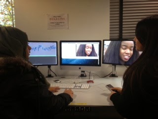
Today is our last day editing as tomorrow is the deadline at 4pm, in todays lesson we added filter to some of the scenes at the beginning of the video as we thought it was too bright.
We also added filter in one of the base track in the chorus scene when we filmed we forgot to take the lights which makes the footage very dark so to conceal the scene with dark lighting we added in super imposing which means adding two clips in front of one another which made the scenes with dark lighting less visible.
We also now have a very clear structure in our video which was missing when we first started editing as we went back and filmed our chorus scene and the beginning of our first chorus.
We also added in the final fade ins and fade outs which gives a smooth flow to the video itself.
We also added the artists name at the beginning of the video we got this idea from Travis Garlend music video.
Editing 04/12/14
It is the day before the deadline and we got feedback from Louisa and she said that we had a much clear sequence than before as our locations were all of the place and now we had changed it to every verse had a different location which also meant that we could use the scenes where our actress shardonnay had curly hair.
We also added the final touches to our music video. We decided to add filters to most of our scenes as it looks much nicer than without. It was important for us to add filter to once of the close up base tracks as before the shot was too dark because the in door lighting switch was switched on which caused the scene to look dark. We added fade ins to the beginning of the music video which made it look nicer and smoother. Also we decided to add her name to the beginning of the music video which we've got from inspo from other music videos such as Travis Garlends music and also the video to Bang Bang by Jessie J, Nicki, Ariana Grande.
Tuesday, 2 December 2014
Monday, 1 December 2014
Subscribe to:
Posts (Atom)


